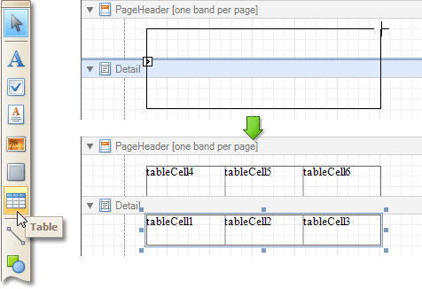
The Table control is designed to arrange information in a tabular layout. It may contain any number of Rows comprised of individual Cells. Both Rows and Cells can be selected and customized individually. In most aspects, a Cell is similar to a Label, but can also contain other controls (e.g. Picture Box or Rich Text).

When a Table is dropped onto a band from the Toolbox, it has one row and three columns. If you click and drag over several bands, the resulting table will be split by the bands into several tables. This creates a table header and the detail table with one mouse move.

When you drag and drop an entire data table from the Field List, a Table with cells bound to the corresponding data fields is created automatically.
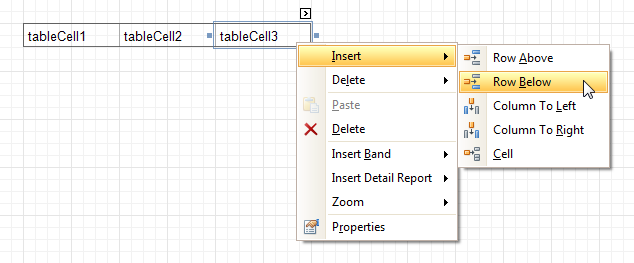
A table's elements are managed by using its Context Menu.

The whole Table, or its individual Row or Cell can be selected either in the Report Designer, the Report Explorer or the drop-down selector of the Property Grid.
In the Property Grid, the Table's properties are divided into the following groups.
 Appearance
-
Background Color
Specifies the background color for the control. This option is also available in the Formatting Toolbar ( ).
).
- Borders, Border Color and Border Width
Specify border settings for the control.
-
Font
Specifies the font settings for the control. Some of these settings are available in the Formatting Toolbar.
-
Foreground Color
Specifies the text color for the control. This option is also available in the Formatting Toolbar ( ).
).
- Formatting Rules
Invokes the Formatting Rules Editor, allowing you to choose which rules should be applied to the control during report generation, and define the precedence of the applied rules. To learn more on this, refer to Conditionally Change a Control's Appearance.
- Padding
Specifies indent values which are used to render the contents of a Table's cells.
- Style Priority
Allows you to define the priority of various style elements (such as background color, border color, etc.). For more information on style inheritance, refer to Understand Styles Concepts.
- Styles
This property allows you to define odd and even styles for the control, as well as to assign an existing style to the control (or a newly created one). For more information on style inheritance, refer to Understand Styles Concepts.
- Text Alignment
Allows you to change the alignment of a Table's text. This option is also available in the Formatting Toolbar.
 Behavior
- Anchor Vertically
Specifies the vertical anchoring style of a Table, so that after page rendering it stays attached to the top control, bottom control, or both.
- Keep Together
Specifies whether the contents of a Table can be horizontally split across pages. In other words, if a Table occupies more space than remains on the page, this property specifies whether the Table should be split between the current page and the next, or whether it will be printed entirely on the next page. This property is in effect only when a Table's content does not fit on the current page. If it does not fit on the next page either, then the Table will be split despite this property's value.
- Scripts
This property contains events, which you can handle with the required scripts. For more information on scripting, refer to Handle Events via Scripts.
-
Visible
Specifies whether the control should be visible in print preview.
 Data
Data
 Design
 Layout
 Navigation
- Bookmark and Parent Bookmark
These properties are intended for the creation of a hierarchical structure within a report called a document map. For an explanation and help, refer to Add Bookmarks.
If the current report has a data source, the Bookmark property can be bound to a data field obtained from the data source. To do this, expand the (Data Bindings) property and in the Bookmark.Binding drop-down selector, select the required data field.


 ).
). ).
).