This document describes how to create a report with a Chart control bound to data, so that all series are auto-created based on a common template, which specifies universal options for all series. This is possible when the data for all series (their names, along with points' arguments and values) are stored in the same data table.
Note that in this scenario, the view type, and certain other settings, will be the same for all series.
To adjust a Chart with automatically created series, do the following.
-
Drop the Chart control from the Toolbox onto the report's Detail band.
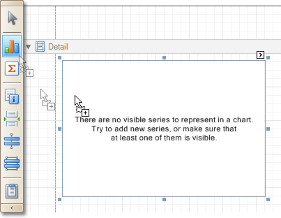
Note that after you drop the Chart, the Chart Wizard may be invoked (if its "Show wizard every time a new chart is added" option is enabled). In this example, we don't need to use the Wizard, so click Cancel to close its window.
-
To bind the Chart to a data source, click its Smart Tag. In the invoked actions list, expand the Data Source drop-down selector, and click Add New DataSource.
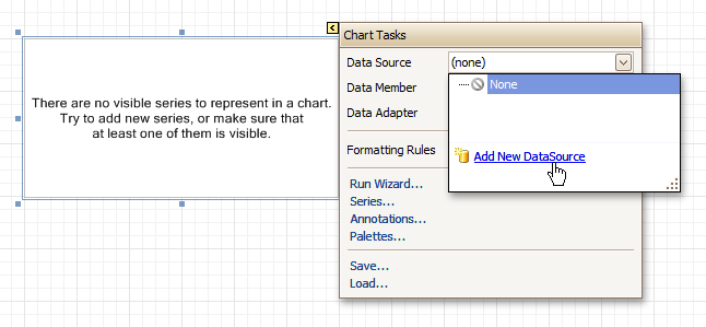
The invoked connection Wizard will guide you through the process of assigning a data source to the Chart. For detailed instructions on the Wizard's steps, refer to Bind a Report to Data, as this process is similar.
 Note
Note Note that after these steps, the report's Data Source property must be set to None.
Otherwise, the Chart will be blank when previewed, and repeated as many times as there are records in the data source.
-
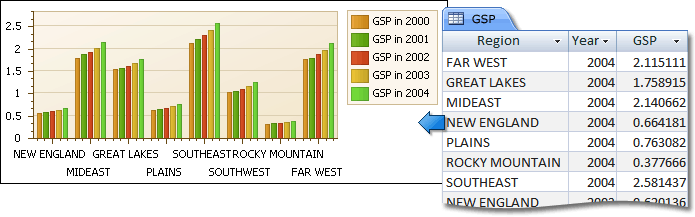
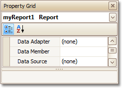
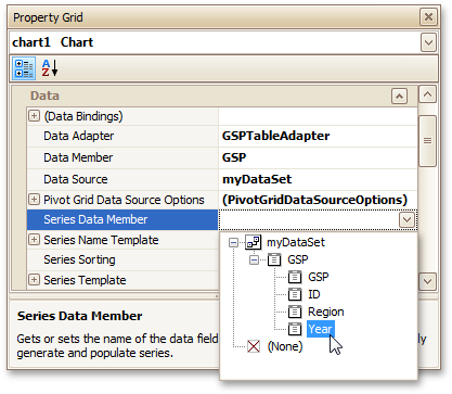
After the dataset is created, it is assigned to the Chart's Data Source property. Its Data Member property defines from which table or view of your dataset the Chart obtains its data. And, the Data Adapter property is auto-defined, as well.
Now, to specify the data field which should provide data for the series names (so that a new series is created for each record in that data field), set the Series Data Member property value.
-
Then, adjust the series template which is accessed via the chart's Series Template property. First, set the Argument Data Member (which specifies from where the data for points' arguments is obtained).
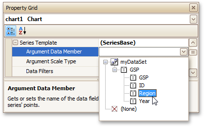
Make sure that the Argument Scale Type property is set to an appropriate value. Otherwise (e.g. when your data is of the date-time type, but this property is set to Qualitative), the resulting Chart will be seriously affected, and incorrectly represent its underlying data.
-
And, specify the Value Data Members property, indicating the data field(s) from which the points' values are obtained.
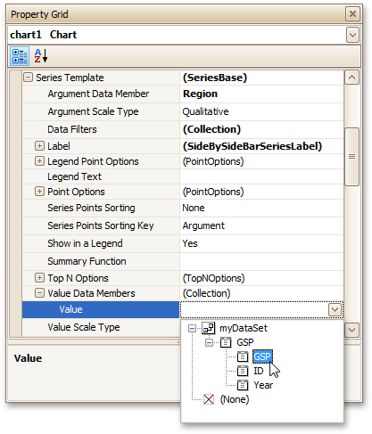
As with the argument, make sure to appropriately specify the Value Scale Type.
-
At this point, the chart's data options are completely defined, so in this step some additional customization capabilities are described.
- Adjust the Series Name Template
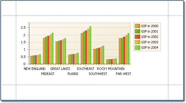
By default, the name for every auto-created series is obtained directly from an appropriate data field in the bound data source. However, you can add some text to the beginning or to the end of every series name, via the Series Name Template property. For instance, here we set the Begin Text property to "GSP in ".- Customize Series Labels
To hide labels for all series points, and prevent a chart from being crowded with numerous overlapping labels, set the Series Template.Label.Visible property to No. Alternatively, you can specify the Resolve Overlapping Mode option, to enable automatic collision detection and resolution for the labels.- Customize Axis Labels
To avoid overlapping axis labels, select an axis and set its Label.Staggered property to Yes.If required, it is possible to customize many other properties for the Chart, which are not described here.
The chart is now ready. Switch to the Preview Tab, and view the result.