This document describes how to create a report with a Chart control bound to data, so that a particular series has its own data source, and other settings. To simplify the example, both series obtain their data from the same data source. However, different data sources can be used for different series, if necessary.
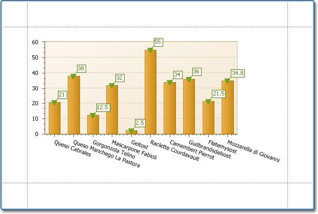
This example describes how to construct a chart of products and their prices for a chosen category.
To adjust a Chart by manually creating its series, do the following.
-
Drop the Chart control from the Toolbox onto the report's Detail band.
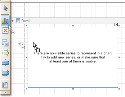
Note that after you drop the Chart, the Chart Wizard may be invoked (if its "Show wizard every time a new chart is added" option is enabled). In this example, we don't need to use the Wizard, so click Cancel to close its window.
-
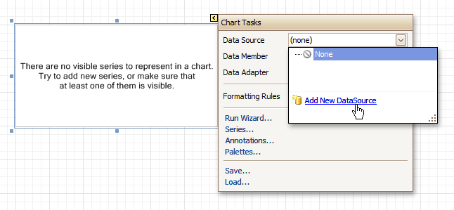
To bind the Chart to a data source, click its Smart Tag. In the invoked actions list, expand the Data Source drop-down selector, and click Add New DataSource.
The invoked connection Wizard will guide you through the process of assigning a data source to the Chart. For detailed instructions on the Wizard's steps, refer to Bind a Report to Data, as this process is similar.
 Note
Note Note that after these steps, the report's Data Source property must be set to None.
Otherwise, the Chart will be blank when previewed, and repeated as many times as there are records in the data source.
-
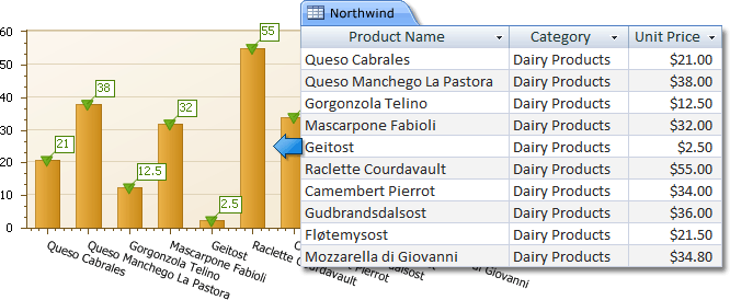
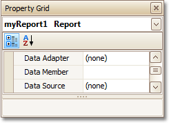
After the dataset is created, it is assigned to the Chart's Data Source property. Its Data Member property defines from which table or view of your dataset the Chart obtains its data. And, the Data Adapter property is auto-defined, as well.
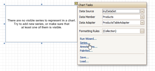
So once again, click the Chart's Smart Tag, and in the invoked actions list, click the Series... link.
-
Now, in the invoked Series Collection Editor, create a series of the required view type (e.g. Bar).
Then, switch to the Properties tab at the right of the editor's window, and assign the existing data set object to the Data Source property of the series. And, assign the required data fields to the Argument Data Member and Value Data Member properties, which determine the coordinates for series points.
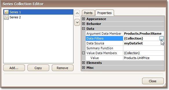
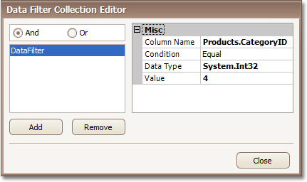
In addition, you can filter the series data. To do this, click the ellipsis button for its Data Filters property, and in the invoked dialog, create and adjust the filtering criteria.
To save the changes and quit the dialog, click Close.
Then, back in the Series Collection Editor, click Copy, to create a similar series, but change its View to Point.
-
Finally, to improve your Chart's appearance, you can make the following adjustments.
- Remove the Chart's legend, as it shows the same data for both series. To do this, click the Legend, and in the Property Grid, set its Visible property to No.
- The point labels for Series1 are unnecessary, so select the label and set its Visible property to No.
- Customize the appearance of the Series2 markers (e.g. replace the default circle with the upside-down triangle by the View.Point Marker Options.Kind property and set its Size to 12).
- Rotate the X-axis labels for better readability. To do this, select the AxisX item in the chart by mouse click, and adjust properties for its labels (via the Label property). For instance, if the Angle property is 20 and the Antialiasing property is set to Yes, the labels look neat.
If required, it is possible to customize many other properties for the Chart, which are not described here.
The chart is now ready. Switch to the Preview Tab, and view the result.